BRAND IDENTITY GUIDELINES
THE PRIMARY LOGO
The Ruralwave logo is fixed artwork. It may not be altered or recreated in any way. The logo is the primary element of the companies identity. Because it spells out the name of the company, it is used in all situations that require the brand to be presented in an official capacity to establish brand identity.

CLEAR SPACE
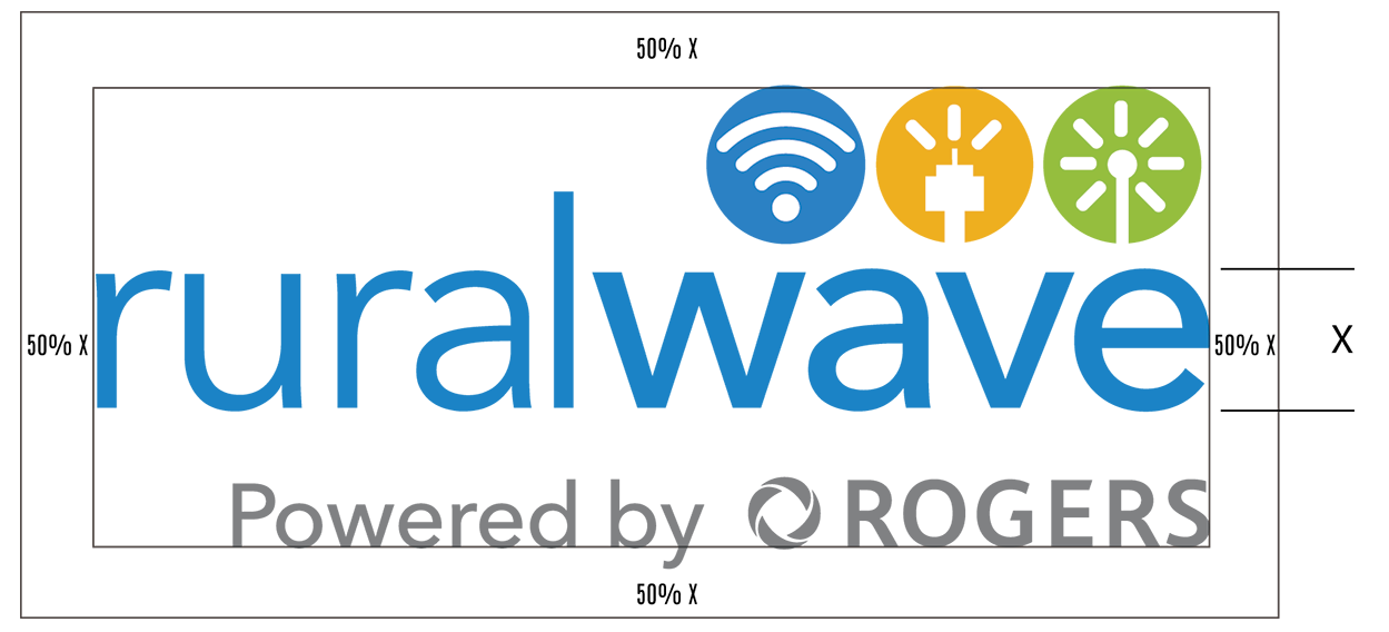
The Ruralwave Logo should always be surrounded by a minimum area of space. A margin of clear space equivalent to 50% of the height of the Lower Case Letters is drawn around the logo to create the invisible boundary of the area of isolation. No other text or graphic element is to be placed within this space so as to interfere with the legibility of the logo.
This clear space remains consistent regardless of the size of the logo.
TYPOGRAPHY
Avenir is the primary typeface for the Ruralwave brand in all print and collateral materials. It is easy to read at small and large sizes. At any size, as body copy or display type, the primary font weight should be Avenir Light or Medium depending on the applications. Heavier weights may be used occasionally for emphasis or to reinforce informational hierarchy, but should never be as body copy font weight.
When used as a display type (e.g., as a headline or primary graphic element), right or left alignment is acceptable, and centered alignment when appropriate.
When used as body copy, text should always be 14 or 16 pt.
Avenir Light
ABCDEFGHIJKLMNOPQRSTUVWXYZ
abcdefghijklmnopqrstuvwxyz
123456789
Avenir Regular
ABCDEFGHIJKLMNOPQRSTUVWXYZ
abcdefghijklmnopqrstuvwxyz
123456789
Avenir Semi Bold
ABCDEFGHIJKLMNOPQRSTUVWXYZ
abcdefghijklmnopqrstuvwxyz
123456789
Avenir Bold
ABCDEFGHIJKLMNOPQRSTUVWXYZ
abcdefghijklmnopqrstuvwxyz
123456789
Heavier weights such as Impact or Oswald and Helvetica Bold Condensed may be used occasionally for emphasis or to reinforce informational hierarchy, but should never be the main font weight.
When used as a display type (e.g., as a headline or primary graphic element), right or left alignment is acceptable, and centered alignment is also allowed in limited circumstances.
Impact, Osqwald or Helvetica Bold Condensed should never be used as body copy text.
Helvetica Bold Condensed, Oswald, Impact
ABCDEFGHIJKLMNOP
abcdefghijklmnopqrs
123456789
Avenir Regular
This, of course, is not the real copy for this advertisement. The real words will be written once you have approved the headline. Rest assured, the words will expand the concept. With clarity. Conviction. And even a little wit. Because in today’s competitive marketing environment, the body copy of your advertisement must lead the reader through a series of disarmingly simple thoughts. All your supporting arguments must be communicated with simplicity and charm.
THE COLOUR PALETTE
The Ruralwave colours palette is based on colours that were used historically to promote or distinguish one company from another (Ruraleave (Blue), Kawartha Cable (Gold) and FibreNet(Green)). These colours were adopted so as to maintain a visual association with the previous companies and their related products.
Blue is the primary of the 3 colours since all companies are now known as Rural Wave. Gold is used to indicate the cable products and Green for all Fibre Optic related products. These colours are not interchangeable and always appear with the primary colour blue first (top or left) followed by Gold and Green.
PANTONE 285
PANTONE 143
PANTONE 375
Hex – #1985c7
RGB – 25/133/199
CMYK – 81/39/0/0

WIFI ICON
Always used to represent all things WIFI
Hex – #f3af30
RGB – 243/175/48
CMYK – 4/34/93/0

CABLE ICON
Always used to represent all things Cable
Hex – #96be0e
RGB – 150/190/14
CMYK – 47/6/100/0

FIBRE ICON
Always used to represent all things Fibre
BRANDED ASSETS
Click the button that describes the specific file for your application. This will automatically download a ZIP file to your desktop. Double click the ZIP icon to extract the file.
